Freelancer:
level08

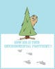
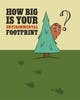
Bigfoot Revised
Hi. I worked on some revisions based on your feedback. I did both because I wasn't sure which layout you are leaning toward. I did a few versions. Adding the word "environmental" seem to make the type to small on the Blue/White version, so I make it two lines instead of one. I also included an alt version with stacked type. For the second version, the green ground one, the additional word seemed to make the text block really heavy. So, I experimented with different looks to help it read better. I included an alter version of that one with staggered type. Let me know what you think. Thanks for the feedback and look forward to more.