Freelancer: Isdesign92
Chia sẻ:
Báo cáo bài thi

2nd version

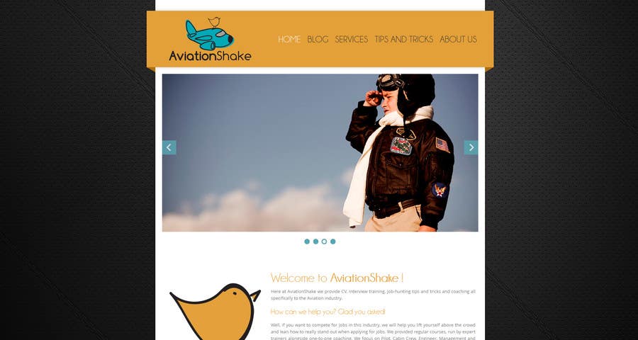
Hey again, uploading my second version, I spend all day working on this one, although is not finished yet, is just for you guys can give me a feedback and see if I am in the right way ^^ Well, as you can see I've change the background for a much more darker one in tons of black (that is more serious and professional), I have also focus more in the orange colors because I beleive that the contrast with the black in the background and the white main frame is awesome (but its up to you). hmm, lets see.. Tell me if is like this that you want the homepage, the carousel can be used to have some callout action (where i can create some images with text embed so they can click, like for the services, etc.) or you can use it to show the latest entries in the blog. the website is fully responsive, and I am working on this project with all my dedication for the last 2 days, so I really hope that you guys like it, or at least that I am in the right way :D I am pretty excited to hear some feedback!
Bài tham dự cuộc thi #10 cho                                                 Create a Wordpress Site for AviationShake.com
Bài tham dự #10

Bảng thông báo công khai

  • Mikebert
    Chủ cuộc thi
    • cách đây 10 năm

    Hi!
    Phenomenal second effort! Thankyou so much for your dedication to this.

    Two developmental comments from me and two from Jay:

    - The background: I like what you've done and I'm a real fan of the tasteful textured background, do you think we could play with the background image to be something more delicate, I absolutely understand what you say about being more serious looking but I'm worried that such a dark, stark background detracts from the content, and that's where we want the visitors looking!

    - The Banner Colour, again, I understand what you're saying but I'm questioning using that orange colour for the top banner. I think that it's a little difficult to accommodate, because it clashes and merges with our Logo. Perhaps softening it slightly to "#acb0ab" (the background colour for the banner on our current site)? It's up to you where you take that, it's just a suggestion!

    ...

    • cách đây 10 năm
    1. Isdesign92
      Isdesign92
      • cách đây 10 năm

      Jay, my idea is to place the call action in the image slider (roulette), like for each image use a relation with text for the CV and interview training and when the people click on it it will be redirect to the proper page, and the large bird is to fill out the homepage with some visual content and to "say" that the following text will be about the AviantionShake, I like to use it as much as I can, because as I am studding business and communication related to design I've learn that when the visitor enter the landing page if he/she sees to much text and not so many images most of the time they don't even read whats there or just leave, but if you want me to change/remove the bird I will do :D

      And once again thank you for your words, it means so much for me :') and as I said before if you have any critic/suggestion please don't hesitate to contact, through here or the links I've said in the last post.

      • cách đây 10 năm
  • Mikebert
    Chủ cuộc thi
    • cách đây 10 năm

    From Jay:

    - She's like to see some relation on the landing page to CV and interview training - I like the effect of the large bird, but I worry that we're wasting valuable 'selling space' above the fold

    - "I really like it!" - Jay, 2013

    Again, please don't take this as anything other than constructive - we really like the basic premise and we're really appreciative of your work so far - we're just trying to get it as "right" as we can!

    Thanks again,
    Mike + Jay

    • cách đây 10 năm
    1. Isdesign92
      Isdesign92
      • cách đây 10 năm

      Hey :D
      Thank you so much for the nice words and the appreciation, for both of you :') I am going to reply to both here, so with the background I will work in something a bit more delicate, do you prefer a texture (kind of this one) or maybe just a simple color or gradient? Regarding the banner I will try another colors and try to match it with the background and the rest of the layout, I tried before in white, and I really like it because the logo looks awesome in a white background (but i am afraid that it will lose a lot of contrast, even with gray :/) and I was thinking also in placing the bird and the plane in the opposite site of the banner, behind the menu with some overlay.

      • cách đây 10 năm