Freelancer: cihangir
Chia sẻ:
Báo cáo bài thi

My Mock Up Designs for Childfund Connect Magazine

Hi, Please take a look at my attached mock up designs for Main page and Photostory Main Page. You can also take a look at links below to get an idea on how it'd look in browser. http://www.zula.ws/clients/childfund/01.html http://www.zula.ws/clients/childfund/02.html Although most of the kids in developed countries already got used to modern interfaces, I tried to pick a theme which has a universal look & feel. Theme contains metaphors like paper, folding, hand drawn elements and some watercolor background. I used childfund's branding ( Darker green) as the primary color of User Interface. and 2 more secondary colors from your brand Guide for interactive areas. Most of the interactive areas are a little bit larger than it should be as you asked for bigger call to actions and navigation. I used customized Title / header for carousel area. I can also provide a PSD template for this area so you can simply create your own covers easily. Please let me know what you think. Regards
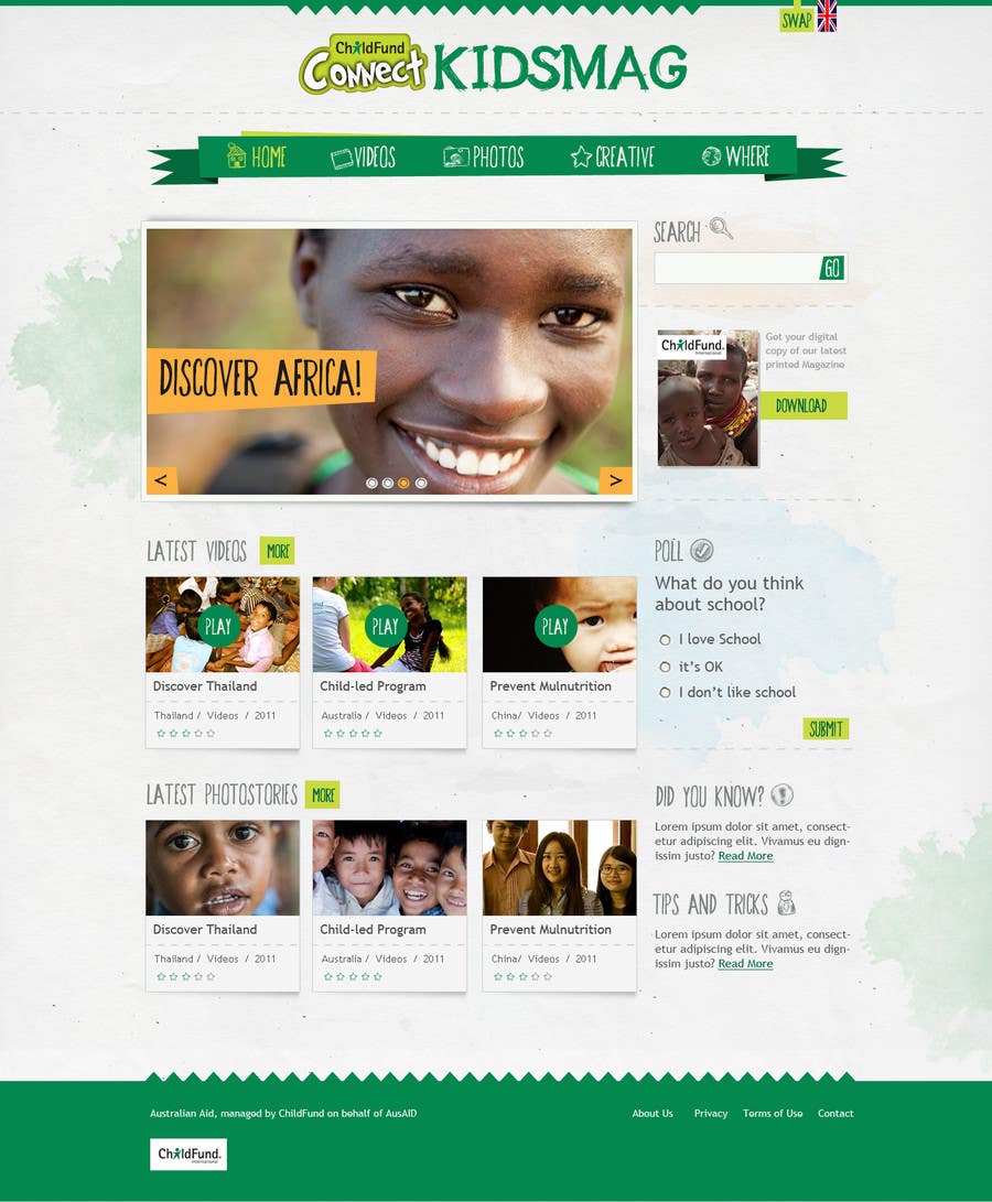
Bài tham dự cuộc thi #8 cho                                                 Design a Website Mockup for educational online magazine for children
Bài tham dự #8

Bảng thông báo công khai

  • rcaceres
    Chủ cuộc thi
    • cách đây 10 năm

    Hi Cihangir,
    The other logo that we need to use is the AustralianAID Identifier.
    The different options for that logo can be found here: http://www.ausaid.gov.au/about/pages/logo.aspx
    Would you be able to add the option that you think would look best to the design? You can see how the logo was added on our other website www.childfundconnect.org
    Thanks

    • cách đây 10 năm
    1. cihangir
      cihangir
      • cách đây 10 năm

      Hi, I wasn't sure about whether childfund connect logo and Australian Ad logo should be equal in weight.

      if that's the case, both logos can be placed around magazine game:
      http://www.zula.ws/clients/childfund/04.html

      if that's not the case, we can place Australian logo off the site grid, it would be visible on all screen resolution though.

      http://www.zula.ws/clients/childfund/05.html

      For me, in design wise, first sample works best and look way more balanced.

      Please take a look.
      Thanks

      • cách đây 10 năm
    2. rcaceres
      Chủ cuộc thi
      • cách đây 10 năm

      Hi Cihangir,
      The requirements of the funding agency is that it should be of at least the same size than the website logo so I think both approaches could work well. I will need to check if the second one is accepted but I think it should be fine, I also agree the first one looks more balanced.
      Thanks again
      Raul

      • cách đây 10 năm
  • rcaceres
    Chủ cuộc thi
    • cách đây 10 năm

    Hi cihangir,
    Thanks for submitting your nice design. I like the thinking process that went behind your idea as well as the use of brand colours and the fonts you used. I feel you have interpreted the brief well. I think most would be achievable through CSS. Would you mind adding a mockup of how you think it would behave on mobile? We are hoping to use a responsive theme. I'm specially interested on how you think you would see the menu working on mobile.
    Thanks again.

    • cách đây 10 năm
    1. cihangir
      cihangir
      • cách đây 10 năm

      Yes, of course. I've already been working with layered and foldered PSDs for this project. All layers and folders are titled. I can also provide a detailed documentation on interaction and specsf for your developers

      • cách đây 10 năm
    2. rcaceres
      Chủ cuộc thi
      • cách đây 10 năm

      Thanks a lot. We will let you know as soon as the decision is made

      • cách đây 10 năm

Xem thêm bình luận Đang xử lí...