Design a Logo for PODDVR.com
- Tình trạng: Closed
- Giải thưởng: $50
- Các bài thi đã nhận: 45
- Người chiến thắng: mahersinjary22

Tóm tắt cuộc thi
Fun but easy-to-read logo with the name "poddvr", as in POD(cast) DVR... a specialized mp3 player app. I'm open to how it's presented... PODdvr or podDVR or whatever... but would like the design to somehow make it CLEAR that there are 2 D's in the name. It would be nice to have a little more art than just the letters... maybe work in a small ipod and/or earbuds? But just the letters is OK if they are stylized in a way that grabs your attention.
I would probably like to stick with primary colors or a complementary palette that catches the eye... don't want anything too gaudy or garish.
Also, I want the ORIGINAL ART file (and font names used) so I can adapt the logo in the future if needed. I want the LAYERED file, Photoshop .psd or Fireworks .png would be preferable.
Các kĩ năng yêu cầu
Bảng thông báo công khai
-

Chủ cuộc thi - cách đây 10 năm
If anyone is interested:
https://www.freelancer.com/contest/Design-a-Logo-for-TimeLine-Player-51112.html- cách đây 10 năm
-

ajdezignz
- cách đây 10 năm
i will post my entry soon sir like before
- cách đây 10 năm
-
Chủ cuộc thi - cách đây 10 năm
don't know if designers get this message, but you might look here:
https://www.freelancer.com/contest/Design-a-Logo-for-AnnotatedTimeLineORG-50218.html- cách đây 10 năm
-

stanbaker
- cách đây 10 năm
On my list of projects.
- cách đây 10 năm
-

jramos
- cách đây 10 năm
wow! gluedtothescreen got the best value, and congratulations to the chosen one!
- cách đây 10 năm
-
Chủ cuộc thi - cách đây 10 năm
Indeed. I was impressed with the quality of the entries. Many COULD have worked but, as always, it's about more than just the art... it's a marketing message and it has to be right for the product.
Best wishes to you all.- cách đây 10 năm
-

mahersinjary22
- cách đây 10 năm
Thanks gluedtothescreen for choosing my design.
It would be great if you could give me a feedback review :)
And I'm ready to follow this project in you have any prints or icon design for your App.- cách đây 10 năm
-

KiVii
- cách đây 10 năm
please check #245
- cách đây 10 năm
-
blueconcepts
- cách đây 10 năm
#237 is the best so far from my point of view. i hope you like it. I am very much motivated. Thanks for those words.
- cách đây 10 năm
-

won7
- cách đây 10 năm
sir, please feedback
- cách đây 10 năm
-

nmomin4u
- cách đây 10 năm
Check #219
- cách đây 10 năm
-
Prashant53
- cách đây 10 năm
Sir , please have a look to entry #207
- cách đây 10 năm
-
Chủ cuộc thi - cách đây 10 năm
Look folks, I cannot comment on every single entry... there are too many and I have a busy schedule.
blueconcepts, you are undoubtedly a talented guy and can put out a wide range of designs. If I was launching a clothing company for the younger crowd, I could see your style doing great! I mean it. Despite good work and many tries, none seemed to fit time.
Others asking for feedback... how about reading my previous posts? Many have not even noted the colors were decided. I even gave some directions (which a few took, to be sure!) but a lot ignored. Obviously if I liked a design, I could get the colors changed... but why not start out on the right foot?- cách đây 10 năm
-
blueconcepts
- cách đây 10 năm
Thanks. Will try untill the last hour.i am learning and discovering myself as well in the competetion.
- cách đây 10 năm
-
blueconcepts
- cách đây 10 năm
we tried our Best.
but failed to create.
Atleast you can give reviews about us in the profile.Money wasnt the purpose of entering into the competetion.
best of luck for your project sir.- cách đây 10 năm
-
won7
- cách đây 10 năm
please feedback
- cách đây 10 năm
-
Chủ cuộc thi - cách đây 10 năm
Props to blueconcepts for the VARIETY of designs, if nothing else. Most of them look great but, unfortunately, I don't feel are best for this project... but I TRULY APPLAUD the effort and creativity.
Many others here have also done a great job, I'm just noting the outstanding quantity of DIFFERENT ones... and the willingness to "step out there" a little bit.- cách đây 10 năm
Xem thêm 2 tin nhắn nữa
-
mahersinjary22
- cách đây 10 năm
I did my best to show you what I came up with, I hope you like still like #98
I don't want to touch it anymore unless you request that. Let me know if there's anything I can do to make it better. Thanks.- cách đây 10 năm
-

carlmolina
- cách đây 10 năm
#180 and #181
- cách đây 10 năm
-

MagicalDesigner
- cách đây 10 năm
#184 please check .
thanks sir- cách đây 10 năm
-
MagicalDesigner
- cách đây 10 năm
#174 please check it sir.
thanks- cách đây 10 năm
-
MagicalDesigner
- cách đây 10 năm
#149 please check and rate it.
thanks sir- cách đây 10 năm
-

Artimization
- cách đây 10 năm
Please feedback #145.
- cách đây 10 năm
-
MagicalDesigner
- cách đây 10 năm
#143 please check.
thanks sir- cách đây 10 năm
-
MagicalDesigner
- cách đây 10 năm
sir please check #142 and comment on it.
thanks sir- cách đây 10 năm
-
blueconcepts
- cách đây 10 năm
my all logos are purpose ful. .
added sympohony signs inplace of r. .used guitars and Cd's in place of O and r Respectively. . simple designs are also dere for u. .- cách đây 10 năm
-

Steeleris
- cách đây 10 năm
Please check and left comment ;) #132 and #131
- cách đây 10 năm
-

Tareq017
- cách đây 10 năm
Please check #125
- cách đây 10 năm
-
Chủ cuộc thi - cách đây 10 năm
PART 3
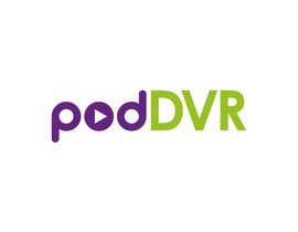
Visually, I lean to the simpler design... I want it to be recognizable AND READABLE. No puzzling out what the spelling is of the semi-hidden letters folded into one another. That's why #98 is leading this contest SO FAR. Maher has done nice work with that and, to win, you will have to come up with either...
1. A better "clean" design. Simple, almost plain, pure. Unambiguous.
2. A superior ALTERNATIVE design... in other words, something that beats the "clean" design itself. Something that just GRABS you visually.- cách đây 10 năm
-
mahersinjary22
- cách đây 10 năm
Thanks - is there anything else I can do to make it better?
- cách đây 10 năm
-
Chủ cuộc thi - cách đây 10 năm
PART 4
#81 - two good things here:
-- the hand touching the button sort of calls for action, which is great, but I think the POD part is too busy for this logo and the O becomes washed out and makes pod hard to read. And I've seen it before. Sorry, this side of the logo won't work.
-- BUT, my eye DOES get drawn to the DVR part... probably because of the reverse background. It DOES remind you of a DVR, though, so there may be some creative possibilities here, a small study of contrasts. The letters are not right, though, and should be more distinct. Perhaps if someone comes up with a better design going in this direction, it might stand a chance of overturning the "cleaner" approach.
Thank you all for your time and efforts. Be well.- cách đây 10 năm
-
Chủ cuộc thi - cách đây 10 năm
PART 2
- I like the idea of bring some extra "art" into the logo, but it would have to just work. Though I don't think these are right for this logo, I DO LIKE (and appreciate) the creativity of:
#25 - those red buds stand out
#44 and #75 - headphones... we saw a lot of these and I've seen it work in other logos but none here so far.
#88 and #102 - I'm weighing the DVR fonts... sort of like these because they make the R stand out.
#110 - bringing the D's together and adding the smile is nice. Not right for this particular logo, though. sorry.- cách đây 10 năm
-
Chủ cuộc thi - cách đây 10 năm
PART 1.
OK, since we're on the downhill side now, here's a little recap. I appreciate all the effort. There were many rejected which were actually fine but just "not quite right" for this project. The beauty of crowd sourcing is the variety of design, so thank you all for that.
- #98 is my favorite so far and I've asked for a couple small changes to the original before arriving at this point.
- The colors WILL be purple and green, but I'm undecided about which parts should be what color.
- Several have integrated a DVR button symbol (Stop, Play, Pause) into the logo and I like that very much.
- I am still not 100% convinced on fonts. I want it clean but distinct/bold, and I'm thinking pod and dvr should not be the same.- cách đây 10 năm
-
Chủ cuộc thi - cách đây 10 năm
folks... I DO appreciate your efforts and am impressed with a lot of the work. There is NO NEED to ask be me review a particular submission UNLESS you have something specific to say about it. I promise...
I WILL look at all submissions. This contest has a few days to go and I fully intend to provide feedback regularly until it is over, and the winner will receive the money.
One last thing. I'm not sure if it's in the description (I'll revise it, if not) but I want the ORIGINAL ART files (and font names used) so I can adapt the logo in the future if needed. I want the LAYERED file, Photoshop .psd or Fireworks .png would be preferable.
Thanks again!- cách đây 10 năm
-
stanbaker
- cách đây 10 năm
Please review my submissions numbers 86 and 87. Thank you.
- cách đây 10 năm
-

benjurieatinen
- cách đây 10 năm
check #79
- cách đây 10 năm
-
MagicalDesigner
- cách đây 10 năm
sir please check logo #77.
Thanks Sir- cách đây 10 năm
-

jbrown67
- cách đây 10 năm
Could you kindly review # 72 Please..
- cách đây 10 năm
-

riddhishrdesai
- cách đây 10 năm
feedback on #70
- cách đây 10 năm
-

andagrounn
- cách đây 10 năm
any feed back on #28 and #65
- cách đây 10 năm
-
mahersinjary22
- cách đây 10 năm
Kindly have a look at #67 #68 and #69 which updated from the previous logo, according to your requests. I hope that you like it more now.
All the best :)- cách đây 10 năm
-

Cbox9
- cách đây 10 năm
any feedback on #62...please....!
- cách đây 10 năm
-
Chủ cuộc thi - cách đây 10 năm
A lot of good efforts, thanks! Here is some feedback:
I definitely like the "play" button in #11 and, though the font is not quite right, it has the best look so far.- cách đây 10 năm
-
mahersinjary22
- cách đây 10 năm
Thanks again - yes, I'll try that.
The only reason I have connected the 2 D's is because I tried to have that 3 Dimensional feel between them, as the lowercase d is a shadow of Uppercase D.
I'll work the DVR more show you a digital font.
Regarding to the colors do you like them so far? Or you want me to try another palette?- cách đây 10 năm
-
Chủ cuộc thi - cách đây 10 năm
the D's close isn't bad, I'm just trying to explore options. The colors are fine.
- cách đây 10 năm
-
Cbox9
- cách đây 10 năm
hello sir Greetings....please check in #62....thank you... :) :) :)..!
- cách đây 10 năm
-
MagicalDesigner
- cách đây 10 năm
kindly sir please check my entry #60 and give me feedback thanks sir
- cách đây 10 năm
-

seo2websites
- cách đây 10 năm
Hi Admin, Please provide feedback for #58
- cách đây 10 năm
-

philipkaiten
- cách đây 10 năm
Just saw what you said , May I try again ?
- cách đây 10 năm
-
Chủ cuộc thi - cách đây 10 năm
Of course! The more, the merrier!
- cách đây 10 năm
Làm thế nào để bắt đầu với cuộc thi
-

Đăng cuộc thi của bạn Nhanh chóng và dễ dàng
-

Nhận được vô số Bài dự thi Từ khắp nơi trên thế giới
-

Trao giải cho bài thi xuất sắc nhất Download File - Đơn giản!