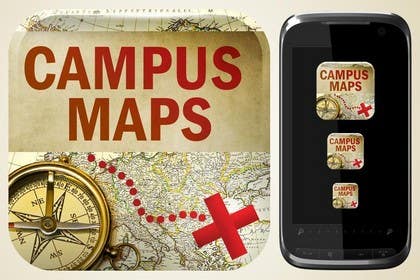
Graphic Design for Campus Maps (iTunes Art)
- Tình trạng: Closed
- Giải thưởng: $100
- Các bài thi đã nhận: 35
- Người chiến thắng: obbycraft

Tóm tắt cuộc thi
Helps people navigate university campuses.
Our tagline is: Need a map? Get the App!
Các kĩ năng yêu cầu
Phản hồi của người thuê
“A pleasure to deal with, very enthusiastic and delivered quality work. Gave a PSD with all parts, which is what I asked for. Was the top rated submission by voters.”
![]() vbhandari01, United States.
vbhandari01, United States.
Bảng thông báo công khai
-

Chủ cuộc thi - cách đây 11 năm
Hi everyone, I have been at a wedding for the past few days and am very sorry I have not been as responsive as I wanted to be. I am putting up a poll now to see what people like, and will have the winner announced soon!
- cách đây 11 năm
-

AncientMariner
- cách đây 11 năm
where will be the polling?
- cách đây 11 năm
-
Chủ cuộc thi - cách đây 11 năm
I put the polling to my friends so I knew who was voting, it should be finished soon.
- cách đây 11 năm
-

robertcjr
- cách đây 11 năm
#42 is copied and used on 100s of web sites!
- cách đây 11 năm
Xem thêm 6 tin nhắn nữa
-
AncientMariner
- cách đây 11 năm
@CH please check this out
- cách đây 11 năm
-
Chủ cuộc thi - cách đây 11 năm
Thank you for this! I had no idea. I thought it was a little surprising seeing his other designs but I didn't think he would cheat.
- cách đây 11 năm
-
athanista
- cách đây 11 năm
Please provide feedback for #54
- cách đây 11 năm
-

IniAku84
- cách đây 11 năm
please #66
- cách đây 11 năm
-
AncientMariner
- cách đây 11 năm
#65 can be the app icon ,
sorry sir but my exams are going on and i cant give you my best , if you want i can make minor changes in these- cách đây 11 năm
-
IniAku84
- cách đây 11 năm
Please rate and comment mine #63 thanks
- cách đây 11 năm
-

Salbatyku
- cách đây 11 năm
- cách đây 11 năm
-
Smartdotsteam
- cách đây 11 năm
hello sir:) check #61 , thanks . Private feedback pls
- cách đây 11 năm
-

MyPrints
- cách đây 11 năm
Wow! Talking about fake entries (#42 and #23), way to go serajsersawi, effortless effort. Woohoo!
- cách đây 11 năm
-

akshay090592
- cách đây 11 năm
check out my design... #58 ...plz give feedback!
- cách đây 11 năm
-
AncientMariner
- cách đây 11 năm
#56 #57 3d rendered , tell me if you like it
56 was just to show it is 3d , something like 57 could be used of you like
and please specify , do you want this for your icon or app page ?- cách đây 11 năm
-

serajsersawi
- cách đây 11 năm
Maybe this #42
- cách đây 11 năm
-
Chủ cuộc thi - cách đây 11 năm
Nice! I like it!!!
- cách đây 11 năm
-
AncientMariner
- cách đây 11 năm
#35 COMPLETELY BASIC
if you like the idea of radar ill show you its better versions
it took time to make the radar so i didnt have time to make better background or text , ill improve it if you like the design- cách đây 11 năm
-
AncientMariner
- cách đây 11 năm
sure ,a and wanted to ask how about a university icon connected to a pin on a map ?
others dont copy please =_=- cách đây 11 năm
-
Chủ cuộc thi - cách đây 11 năm
I don't want to accidentally infringe on a university's copyright, or tie it down to one university so I've tried to stay away from getting too specific with universities. If you're still interested in trying it out, go for it! I won't say no to seeing what you bring :D
- cách đây 11 năm
-

Ayahmedia
- cách đây 11 năm
please check #40
i've tried to make something diffrent- cách đây 11 năm
-
Ayahmedia
- cách đây 11 năm
Please i need feedback to improve my skills kindly view my entry no39
- cách đây 11 năm
-
Chủ cuộc thi - cách đây 11 năm
Sure thing, no problem.
- I think you did a good job of creating the map and identifying the theme.
- I would recommend that generally the dotted lines on a map go the other way (length wise leading to the treasure or X).
- I would recommend making the title a LOT lighter, to increase the contrast heavily. This will make the title more visible and draw more attention to it You can also do this by making the border/stroke of the title very light, to make it "pop" more as the term is called.
- I think in general the meshing of the overall concept could use a little reworking (with the telescope coming out of the compass for example, or the dark text on dark background). It could be useful to put the text off of the map if you don't want to change the color of it.
Thank you for your submission!- cách đây 11 năm
-
Ayahmedia
- cách đây 11 năm
Thanks so much!
- cách đây 11 năm
-
Ayahmedia
- cách đây 11 năm
sorry #39
- cách đây 11 năm
-
serajsersawi
- cách đây 11 năm
Playing around just trying to come up with a good idea #36
- cách đây 11 năm
-
Chủ cuộc thi - cách đây 11 năm
I think I like the top right one the most out of these.
Feedback:
- The idea of putting the pin on the map is fantastic, because the app puts a pin on the map.
- I'd love to see where you play around with the theme of the pin.
- I don't particularly like splitting the name. and I figured out the thing about the word maps.
- Maybe putting the word maps directly underneath campus would help the word "map" be more visible, with the actual map underneath the words?- cách đây 11 năm
-

marijoing
- cách đây 11 năm
- cách đây 11 năm
-
Chủ cuộc thi - cách đây 11 năm
I think this is an interesting theme! I like how the map could be taken for a college campus map. The fundamentals are solid, but it doesn't catch my attention like some of the other ideas you've had. Could I see it without the compass? I think just the red X and trail might work well for this piece!
- cách đây 11 năm
-
marijoing
- cách đây 11 năm
Hi, i've come up with something a bit different.. waiting for your feedback! :) thanks.
- cách đây 11 năm
-
Chủ cuộc thi - cách đây 11 năm
Sent you a message!
- cách đây 11 năm
-
Chủ cuộc thi - cách đây 11 năm
Keep in mind it doesn't have to be a Pirate Map, #23 came out of no where and really aced it! Feel free to be creative guys, those were mainly suggestions to get the creativity started. I thought it might be easier if there was a suggested theme. I look forward to what else you guys bring to the contest!
- cách đây 11 năm
-

drawnsean
- cách đây 11 năm
Submitted mine. :) #27 Feedback appreciated
- cách đây 11 năm
-
Chủ cuộc thi - cách đây 11 năm
Thank you! Some thoughts:
- Please include an "S" at the end of Map (Campus Maps)
- If you could display it off of the phone as well as beside it that would be fantastic, I got a little distracted.
- Maybe a little less emphasis on the compass and coins, and more on the map or maybe the perspective on the phone is throwing me off. I think I can give better feedback seeing it standalone. #13 has a brilliant format.- cách đây 11 năm
-

CaTx
- cách đây 11 năm
check #26
- cách đây 11 năm
-
Chủ cuộc thi - cách đây 11 năm
Thank you for your effort! I think the use of blur might be a little difficult to draw attention to one part, especially with the slanted text I felt a little disoriented. I'm primarily looking for more of a standard iconish, artish kind of style. Thanks for trying out a new style though, it's definitely something I haven't seen before.
- cách đây 11 năm
-
serajsersawi
- cách đây 11 năm
Take a look at #21 :)
- cách đây 11 năm
-
serajsersawi
- cách đây 11 năm
#23 Something different far away from pirates
- cách đây 11 năm
-
Chủ cuộc thi - cách đây 11 năm
Sweet! This is totally creative and I really like it!
Thoughts:
- I think the word maps might be a little hard to read, maybe taking it off of the map or highlighting it some how would be good?
- I like the font choice, and the word "campus" and the map itself is very easy to identify. Very distinctive icon, and feels very playful. I think your creativity paid off.- cách đây 11 năm
-
serajsersawi
- cách đây 11 năm
Kindly Check #4 Sorry for withdrawing #3 there was a problem
- cách đây 11 năm
-
Chủ cuộc thi - cách đây 11 năm
I like the originality behind this piece. You are on the right track, I would like to emphasize the app title and the path a little more (a treasure chest is fine, that was a great creative approach!). I like how the tree comes off of the map, it adds a nice touch. I don't think the compass is necessary or maybe swap how much the amount that compass and the dotted line/title stand out - I feel like the compass stands out a lot in comparison to the title and treasure chest/dotted line.
- cách đây 11 năm
-
serajsersawi
- cách đây 11 năm
Working on your tips
- cách đây 11 năm
-

amanduttsharma33
- cách đây 11 năm
pls chek #17
- cách đây 11 năm
-
Chủ cuộc thi - cách đây 11 năm
Thanks for your effort! I like the readability of your design. A thought is that maybe moving away from the skull and bones could be interesting? Maybe something like a ship or compass, or even a star! Feel free to explore creatively :)
- cách đây 11 năm
-
Chủ cuộc thi - cách đây 11 năm
I would like to emphasize that the title and the path are what I consider the two most eye-catching aspects - the title and path/ X spot should be easily visible from the thumbnail (don't be afraid to make the title 25-30% of the graphic). Marijoing is on the right path with submission #8 on how to make the title stand out in relation to the graphic. johnvjs is on the right path with the map styles (For example, #5).
Keep in mind that this is basically an advertisement for the app.
- The name is important and should stand out
- I refer to the path and X a lot because they portray what it does, basically the app gets people to their location. Feel free to portray this however you want, but this was just what came to my mind. I think it is important that the functionality of the app stand out somehow, by depicting the path with emphasis or whatever creative way you come up with!- cách đây 11 năm
-
marijoing
- cách đây 11 năm
Hi - thanks for clarify this! I'll make changes on the map background, any feedback on how to improve my design will be much appreciate. thanks!
- cách đây 11 năm
-

mmorscher
- cách đây 11 năm
I have submitted my design for Campus Maps. In many applications and websites in general, logos are simple and contain a recognizable but low-key text of the company name, and occasionally an emblem to highlight the purpose of the company and give it identity. The graphic submitted by myself captures the essence of all of the above.
The image I have created is completely original, with no stock art used. I can crop it to any dimensions or sizes, as well as change the ratio of the logo to empty space, for example a standard iPhone screen size for a loading page, an overhead banner as an in-app logo, and an app icon size. Also available as an option is the addition of your slogan/tag line, however for an iTunes art I have omitted it.
The Campus Maps idea is wonderful, and I look forward to showing you more of my expertise and working with you to tweak and perfect your company's identity.- cách đây 11 năm
-
Chủ cuộc thi - cách đây 11 năm
Thank you for your submission, I appreciate your time. This is definitely a creative approach to the project spec. I would strongly prefer if the icon contained a map. I look forward to any other ideas you have!
- cách đây 11 năm
-
Mjauu
- cách đây 11 năm
PSD format cant be uploaded... you set valid only AI and EPS format
- cách đây 11 năm
-
Chủ cuộc thi - cách đây 11 năm
My apologies. I asked Live Support and they said it should work, I will ask them again.
- cách đây 11 năm
Làm thế nào để bắt đầu với cuộc thi
-

Đăng cuộc thi của bạn Nhanh chóng và dễ dàng
-

Nhận được vô số Bài dự thi Từ khắp nơi trên thế giới
-

Trao giải cho bài thi xuất sắc nhất Download File - Đơn giản!