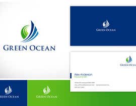
Logo and Business Card Design for Green Ocean
- Tình trạng: Closed
- Giải thưởng: $290
- Các bài thi đã nhận: 13
- Người chiến thắng: twindesigner

Tóm tắt cuộc thi
Green Ocean is a private investment management company that has been operating for almost 20 years. We specialize in real estate of all natures (residential, rural and commercial), the company has grown significantly in the past 5 years and we now require
Các kĩ năng yêu cầu
Phản hồi của người thuê
“Fantastic work, communicates well and delivers exceptional and professional results. Very happy!”
![]() espiritu360, Australia.
espiritu360, Australia.
Bảng thông báo công khai
-

Makstuff
- cách đây 10 năm
i like #568 card design...
i need its psd file.. cann u pls sent me pls...- cách đây 10 năm
-

logos786
- cách đây 11 năm
congrats @twindesigner!!
- cách đây 11 năm
-

twindesigner
- cách đây 11 năm
thank you guys !
- cách đây 11 năm
-

smartGFD
- cách đây 11 năm
congrats :)
- cách đây 11 năm
-

timedsgn
- cách đây 11 năm
congrats @twindesigner!!
- cách đây 11 năm
-

hasu01
- cách đây 11 năm
congratulation twindesigner, its a great design !
- cách đây 11 năm
-

iffikhan
- cách đây 11 năm
Twin the best !!! Congratz.
- cách đây 11 năm
-

ArtworksDesign
- cách đây 11 năm
Please check at #749 . I will revision this logo to you. Thanks :)
- cách đây 11 năm
-

AnggiAlfonso
- cách đây 11 năm
#742 simple and smooth color..no gradient just flat color
- cách đây 11 năm
-

logss
- cách đây 11 năm
DEAR CH, PLS CHECK #741, #734, #733, #730, #712. THANK U !
- cách đây 11 năm
-

maidenbrand
- cách đây 11 năm
Hi CH when i had put entry #397 you reject it and #617 is similar and he got 3stars
- cách đây 11 năm
-

naatDesign
- cách đây 11 năm
#697
regards- cách đây 11 năm
-

IniAku84
- cách đây 11 năm
#693 please, try to make it more simple than before hope you like it.
- cách đây 11 năm
-
hasu01
- cách đây 11 năm
Great work twindesigner #499
- cách đây 11 năm
-
twindesigner
- cách đây 11 năm
thanks hasu !
- cách đây 11 năm
-
ArtworksDesign
- cách đây 11 năm
Hi,Sir, Please check at #681 , #682 , #683 . Give some feedback , please. Thanks :)
- cách đây 11 năm
-

coreYes
- cách đây 11 năm
#613 let me know please what do you think about it. Thank you!
- cách đây 11 năm
Xem thêm 2 tin nhắn nữa
-

zidan8
- cách đây 11 năm
GOOD LOOK #651
- cách đây 11 năm
-

paiso
- cách đây 11 năm
hello sir, please comment or rate
- cách đây 11 năm
-

Chủ cuộc thi - cách đây 11 năm
Please attach numbers.
- cách đây 11 năm
-
smartGFD
- cách đây 11 năm
kindly pls review #629 #631 #636
- cách đây 11 năm
-
Chủ cuộc thi - cách đây 11 năm
Sorry, please review the brief and have another try. Thank you!
- cách đây 11 năm
-

kenjiecuarto
- cách đây 11 năm
Good Day Sir Please Kindly Check #635 Thanks.
- cách đây 11 năm
-
Chủ cuộc thi - cách đây 11 năm
Sorry, please review the brief and have another try. Thank you!
- cách đây 11 năm
-

ajeeshin
- cách đây 11 năm
are you like black #630
- cách đây 11 năm
-
Chủ cuộc thi - cách đây 11 năm
Hi, i don't mind the black, but this looks too much like #508 .
- cách đây 11 năm
-
IniAku84
- cách đây 11 năm
Hi there, please rate and comment #618 #620 Thanks
- cách đây 11 năm
-
Chủ cuộc thi - cách đây 11 năm
#620 has potential but the logo is not integrated well enough. I would like a logo that is very clean and professional. Thank you!
- cách đây 11 năm
-

ayushjain26
- cách đây 11 năm
Hey,
Uploaded #607 and #608 ....Both are the same but the background is different..the finishing on the building is not complete..if you like this idea do tell me so that i can complete.
Updated logo - Showing postiive growth in green and building like structure under it. :)- cách đây 11 năm
-
Chủ cuộc thi - cách đây 11 năm
Hi ayushijain26, i love the layout of the design. There still needs to be more work on the logo, at this point in time with less than a day to go, i don't think a submission to the calibre of other submissions will be possible. I don't want to waste your time on something i don't feel you can win. Thank you for your submissions! You are free to continue submitting if you choose to, but all the other finalists involved days of revisions to get to their degree of finish.
- cách đây 11 năm
-
ayushjain26
- cách đây 11 năm
Hey espiritu360,
No problem..learnt something new anyways..was great to be a part of this..hopefully will work with you in coming future.
May the best design win :)- cách đây 11 năm
-
logos786
- cách đây 11 năm
HI CH
CHECK ENTRIES WITH FONTS CHANGING
THANKS- cách đây 11 năm
-
Chủ cuộc thi - cách đây 11 năm
Ideal is all capitalized with G and O bigger than the rest. Thank you!
- cách đây 11 năm
-
Chủ cuộc thi - cách đây 11 năm
Thank you for the change, reverse side should only have 1 logo feature. So either keep the small one or the big one. The font is too bold at the moment, only the name should stand out, everything else should be not as prominent. On the reverse the two key features are the name and company name. Rest is standard and should not catch your attention immediately. Have another go at the detail fonts. Good work!
- cách đây 11 năm
-
ayushjain26
- cách đây 11 năm
Transparent Design..Unique..The artwork shows Buildings and sea waves..The Barcode can be scanned from a smartphone which will link you to your mail id or the webpage or a file.
- cách đây 11 năm
-
ayushjain26
- cách đây 11 năm
The logo also describes the earth on top(Green) and ocean below(blue)...Tried to keep it simple as you described in the brief :)
- cách đây 11 năm
-
Chủ cuộc thi - cách đây 11 năm
Well done! This is a great first entry. Could you go easy on the sea waves on the bottom and don't take buildings so literally. I'd like to see a more abstract representation. At the moment, the logo template is brilliant and clean. But the logo doesn't display a corporate identity. Keep working on the logo and look at the 4 key words that i am after and try to reflect this in the logo. The layout is great! Good work!
- cách đây 11 năm
-

ionitza
- cách đây 11 năm
#569
- cách đây 11 năm
-
Chủ cuộc thi - cách đây 11 năm
Design is overly simplistic. Lacks corporate identity. Please review brief! Thank you!
- cách đây 11 năm
-
fatawu0098
- cách đây 11 năm
#561 please check, would appreciate review if you can, thank you
- cách đây 11 năm
-
Chủ cuộc thi - cách đây 11 năm
Design isn't integrated enough. Please review brief. Thank you!
- cách đây 11 năm
-
ayushjain26
- cách đây 11 năm
Hey, This is a late entry to the competition and i will be uploading the designs in few hours...Are Information Provided by other designers on the business card correct?
- cách đây 11 năm
-
Chủ cuộc thi - cách đây 11 năm
Hi, yes they are correct. Name, title, address, mobile, email. Thank you!
- cách đây 11 năm
-
malakark
- cách đây 11 năm
In #575 colors are lighter than in #574 , thanks
- cách đây 11 năm
-
Chủ cuộc thi - cách đây 11 năm
Colours are fine, work on the font on the detail side. The name stands out too much at the moment.
- cách đây 11 năm
-
malakark
- cách đây 11 năm
Please consider my latest update #574 thank you
- cách đây 11 năm
-
naatDesign
- cách đây 11 năm
#518 #519
Regards :)- cách đây 11 năm
-
Chủ cuộc thi - cách đây 11 năm
#519 has potential, i'd work on the back side with all the details. It's a bit too cluttered at the moment, go for a cleaner and more professional looks.
- cách đây 11 năm
Làm thế nào để bắt đầu với cuộc thi
-

Đăng cuộc thi của bạn Nhanh chóng và dễ dàng
-

Nhận được vô số Bài dự thi Từ khắp nơi trên thế giới
-

Trao giải cho bài thi xuất sắc nhất Download File - Đơn giản!