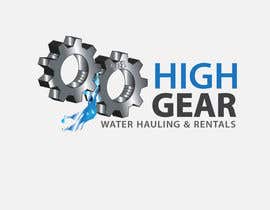
Redesign/revisualization of the current Logo for High Gear Water Hauling & Rentals
- Tình trạng: Closed
- Giải thưởng: $46
- Các bài thi đã nhận: 53
- Người chiến thắng: arteastik

Tóm tắt cuộc thi
As far as design; there are a couple things I would like to stay consistent:
1) Concept is 2 Gears Meshing together
2) I want a '98 subtly designed into the inside one of the gears, that is the year we started.
3) Colors are Silver and Dark Blue
4) Looking for an updated version of existing logo
5) There is some flexibility on the way the Business name is displayed,but the gears need to be stunning and 3D
6) Because this is a water hauling company I would like to incorporate water coming out of between the gears
7) There needs to be two versions of the logo creation, for each side of a company truck. The gears need to be mirrored so that they are facing the same way on the other side of the truck. So the Gears need to be going the same direction in both versions just the text will be on the opposite side so it wont be backwards.
Please feel free to PM me if you have any further questions!! I will be monitoring the contest to rate all entries and give me opinion.
Các kĩ năng yêu cầu
Bảng thông báo công khai
-

Chủ cuộc thi - cách đây 10 năm
I meant more in line wiht the logo but I really just want to see some creative ways for the business name to be displayed other than one line over the other
- cách đây 10 năm
-

samrouge7847
- cách đây 10 năm
- cách đây 10 năm
-
samrouge7847
- cách đây 10 năm
is it possible to send 1 more entry?
- cách đây 10 năm
-

Nertrocity
- cách đây 10 năm
did i stray too far? #54
- cách đây 10 năm
-
Chủ cuộc thi - cách đây 10 năm
I like the designs, could you provide a different way for the business name to be displayed so It could be more uniform with the logo?
- cách đây 10 năm
-
samrouge7847
- cách đây 10 năm
do u want d reflection of d text like d logo or d color shud b more matched??i mean in what aspect u want d text to b more uniform?plz clarify
thanks- cách đây 10 năm
-
Chủ cuộc thi - cách đây 10 năm
I meant more in line wiht the logo but I really just want to see some creative ways for the business name to be displayed other than one line over the other
- cách đây 10 năm
-

creaturethehero
- cách đây 10 năm
PLZ haVE A LOOK ON #37 #38 #40
- cách đây 10 năm
-
Chủ cuộc thi - cách đây 10 năm
I like the designs, could you provide a different way for the business name to be displayed so It could be more uniform with the logo?
- cách đây 10 năm
-
samrouge7847
- cách đây 10 năm
Plz check entry #45
Thanks- cách đây 10 năm
-
samrouge7847
- cách đây 10 năm
Hi,
Plz check entry #43 #44
thanks
Geek-O-Write- cách đây 10 năm
-
creaturethehero
- cách đây 10 năm
- cách đây 10 năm
-

agaramja
- cách đây 10 năm
Please loo my handwork #34
- cách đây 10 năm
-

sharadhatri
- cách đây 10 năm
have a look at #30
- cách đây 10 năm
-
creaturethehero
- cách đây 10 năm
plz look at #16 #17 #18 #19
and provide me your valueable feedback..
if any changes required plz let me know- cách đây 10 năm
-
sharadhatri
- cách đây 10 năm
any suggestions for improvement #15
- cách đây 10 năm
-
Cabeiri
- cách đây 10 năm
Are you going to use this logo for prints? Because if you do, then you will need a high resolution logo (vector format) so you can scale it. Also, will .psd work for you, or you'll be needing .ai, .cdr etc.?
- cách đây 10 năm
Xem thêm 6 tin nhắn nữa
-
Cabeiri
- cách đây 10 năm
Ok :)... I understand now. I'll redo the logo with some gears that look more real/rugged and keep the placement the same. Thank you for your patience and input. I really appreciate.
- cách đây 10 năm
-
Cabeiri
- cách đây 10 năm
Done. Entry #13 . Let me know if the gears look close enough of what you looking for. I've tried to make them look more metallic.
- cách đây 10 năm
-
Chủ cuộc thi - cách đây 10 năm
The placement of the gears is definitely what we are looking for but we need to have the gears looking more rugged more real like entry 10 but even better. The idea is that the wording will be flexible and could be changed after the main thing is the focus on the gears to draw the eyes
- cách đây 10 năm
-
Chủ cuộc thi - cách đây 10 năm
The gears are really the type we are looking for real word types of gears sitting together intertwined just like in the original logo The gears in entry 10 are the closest to what we are looking for the more real the better
- cách đây 10 năm
-
Chủ cuộc thi - cách đây 10 năm
These gears are the most 3d yet but they need to be moving together similar to the existing logo I post and more 3d. The water itself can simply be a small amount coming out of inbetween the 2 gears. I like the year in the gear! but it would be better if it ONLY said '98 so it is more subtle. Best entry yet though keep em coming!
- cách đây 10 năm
-
Chủ cuộc thi - cách đây 10 năm
The whole idea is to redesign the original with welcome innovations. The client likes the original logo so he wants new Gears but much more 3d much like yours but running together and is open to the wording being arranged differntly
- cách đây 10 năm
-
Chủ cuộc thi - cách đây 10 năm
The gears are really the type we are looking for real word types of gears sitting together intertwined just like in the original logo
- cách đây 10 năm
-
samrouge7847
- cách đây 10 năm
Plz rate #7
hope will like
plz give me some feedback if any correction needed
Thanks
Geek-O-Write- cách đây 10 năm
-
Chủ cuộc thi - cách đây 10 năm
Also Please look at the attached logo so you can see what we are working with
- cách đây 10 năm
-
Chủ cuộc thi - cách đây 10 năm
Hey Guys, The logos above are missing the 3D gears they need to stand out that's the biggest innovation we need to see in this logo design
- cách đây 10 năm
-

mantrasoft
- cách đây 10 năm
check out #5 . thanks :)
- cách đây 10 năm
-
mantrasoft
- cách đây 10 năm
Please check #4
- cách đây 10 năm
-

rogeriolmarcos
- cách đây 10 năm
Thanks for invite, what is the company truck that is designed to mock-up.
- cách đây 10 năm
-
rogeriolmarcos
- cách đây 10 năm
Ok Thanks.
- cách đây 10 năm
-
Chủ cuộc thi - cách đây 10 năm
The two gears need to be 3d and grinding into the other one like the posted logo that I attached to the brief
- cách đây 10 năm
Làm thế nào để bắt đầu với cuộc thi
-

Đăng cuộc thi của bạn Nhanh chóng và dễ dàng
-

Nhận được vô số Bài dự thi Từ khắp nơi trên thế giới
-

Trao giải cho bài thi xuất sắc nhất Download File - Đơn giản!