Freelancer:
dawidurbanski
Logo design LAYBACH part 2
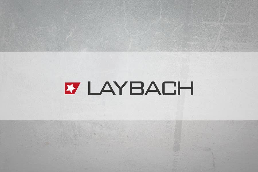
Hi! Here's my design. Very simple but still very effective, elegant and aestethic. The "icon", is made by cut the negatvie space which was formed by connecting letters L and A, and inside this space , also as a negative is star. All that give quite funky style, but also is very elegant and professional. Regards. Dawid.


