Freelancer: jkvaalee
Chia sẻ:
Báo cáo bài thi

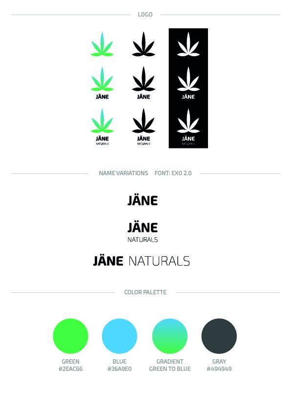
Visual Identity for JÄNE NATURALS

Here you have some suggestions. Hope you like it! (let me know if you would like me to do any changes)
Bài tham dự cuộc thi #2 cho                                                 Create Logo, Print and Packaging Designs for Jane (Cold Press Cannabis Juice)
Bài tham dự #2

Bảng thông báo công khai

  • jkvaalee
    jkvaalee
    • cách đây 8 năm

    I see! The bottle were meant for a mockup. Try to give me some spesific guidlines, and i'll try to change the design to what you would like better :)

    • cách đây 8 năm
    1. kaylemather
      Chủ cuộc thi
      • cách đây 8 năm

      If we wanted to print a paper label: black, brown or white. How would you display that in a way that's similar to the signage that you mocked up?

      • cách đây 8 năm
  • kaylemather
    Chủ cuộc thi
    • cách đây 8 năm

    Overall, very curious if you can take a mixed approach to the logo and the signage and try a more subtle suggestion of the cannabis, rather than the bold flat cannabis leaf? Thank you very much for your efforts!

    • cách đây 8 năm
  • kaylemather
    Chủ cuộc thi
    • cách đây 8 năm

    This rustic signage and symbolism of the crate style or old fashioned history of our beverage comes through here and is favorable.

    • cách đây 8 năm
  • kaylemather
    Chủ cuộc thi
    • cách đây 8 năm

    Beautiful tag.

    • cách đây 8 năm
  • kaylemather
    Chủ cuộc thi
    • cách đây 8 năm

    This gradient and simple logo is our favorite. Fresh and friendly comes to mind.

    • cách đây 8 năm
  • kaylemather
    Chủ cuộc thi
    • cách đây 8 năm

    The soft yet crisp modern style is very appealing. We have toyed with the cork stopper bottle back and forth... We quite like it and yet some of our customers of provided feedback stating that it does not immediately look like something drinkable...

    • cách đây 8 năm

Xem thêm bình luận Đang xử lí...