Freelancer: HerdMedia
Chia sẻ:
Báo cáo bài thi

Logo re-interpretation

Hi Chris, let me know if I'm on the right track with this one, thank you :)
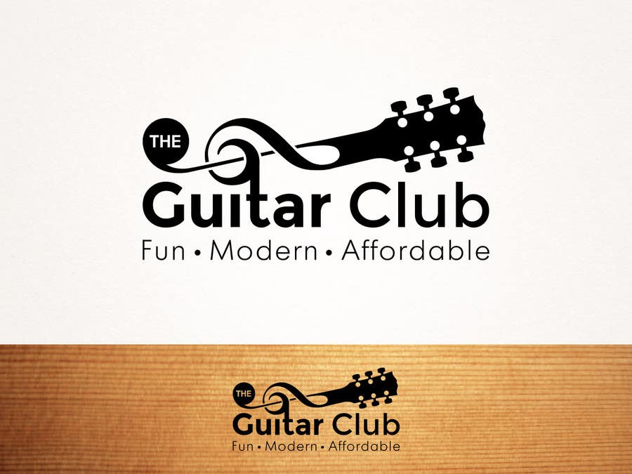
Bài tham dự cuộc thi #40 cho                                                 ► The Guitar Club
Bài tham dự #40

Bảng thông báo công khai

  • chrisellington
    Chủ cuộc thi
    • cách đây 10 năm

    Hi, it's interesting but I feel the treble clef / guitar neck could be better simiplified. There's something I really like about it though. Promising start. Many thanks, Chris

    • cách đây 10 năm
    1. chrisellington
      Chủ cuộc thi
      • cách đây 10 năm

      Still really keen on your logo but I like the symbol in 70 * how the treble clef symbol and guitar body and neck are merged. The font in yours is good, overall would be great if you could improve the symbol. Thanks and keep up the hard work. Chris

      • cách đây 10 năm
    2. HerdMedia
      HerdMedia
      • cách đây 10 năm

      Thanks for the response Chris! I'm sure your hands are quite busy with this contest..

      Just btw - did you see that #70 has more than one entry? There are 2 different version of the logo - one that is shaped more like a guitar (let's not worry about colour at this stage, but I feel if you are looking for a younger audience you will need some colour in this logo), and there is another version of the logo that is just the treble clef and guitar neck. Just want to clarify your tendencies, thank you.

      Look forward to hearing from you!

      • cách đây 10 năm