Basic Text Logo

  • Tình trạng: Closed
  • Giải thưởng: $50
  • Các bài thi đã nhận: 144
  • Người chiến thắng: TheCUTStudios

Tóm tắt cuộc thi

***Edit. I removed the section regarding sunglasses as I think it was too vague of a concept from me. Focus on creating a unique, balanced and clean looking X7 and that is likely what will win the gig. Thanks.***

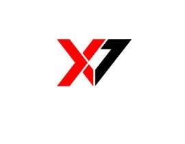
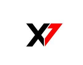
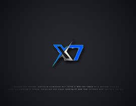
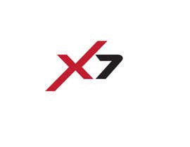
I need a logo for my gaming channel that can be used across web, print and hats. The logo would need to be basic with all aspects connected with no free floating pieces. X7 is the heart of the logo since X7 is actually the identifier for my brand. It is perfectly fine if the logo is simply a stylized version of X7.

The piece will need to be bold but not bloated so no thin or fat text or script writing please. My color preference is the red family and I do not like radiant or gradient images. One color is fine and it does not need to have a border.

Finally, the format I prefer is vector as I need to resize the image to as small as 16X16 pixels and up to 320X320 pixel and the image remain sharp and legible. Also the background for the image must be transparent.

Các kĩ năng yêu cầu

Phản hồi của người thuê

“Sher A. was able to take the limited vision for a logo I had and turn it into exactly what I was looking for. Sher A. was very responsive and made tweaks to insure the project met my every need. Pleasure working with you. ”

Hình ảnh hồ sơ AscendX7, United States.

Những bài dự thi tốt nhất dự cuộc thi này

Xem thêm bài dự thi

Bảng thông báo công khai

  • rifatmia2016
    rifatmia2016
    • cách đây 5 năm

    i hope like my logo Design please check my entry # 285

    • cách đây 5 năm
  • cikhazzdesign
    cikhazzdesign
    • cách đây 5 năm

    Hi sir/madam, please check my entries #280 and #281 . If you want to change anything, please let me know. Hopes you like it. Thank you! :)

    • cách đây 5 năm
  • islamshofik
    islamshofik
    • cách đây 5 năm

    please check my entry # 278, thank you.

    • cách đây 5 năm
  • Mahbud69
    Mahbud69
    • cách đây 5 năm

    Please sir check #235 #236 #237 #239 #240 I hope you like and if you need any change tell me. Thanks

    • cách đây 5 năm
  • islamshofik
    islamshofik
    • cách đây 5 năm

    please check my design #233 & #234 give me 5 star please, Thank you.

    • cách đây 5 năm
  • TheCUTStudios
    TheCUTStudios
    • cách đây 5 năm

    #172 copied my design

    • cách đây 5 năm
    1. TheCUTStudios
      TheCUTStudios
      • cách đây 5 năm

      100% copied my design idea, very disappointing.Please report him

      • cách đây 5 năm
    2. TheCUTStudios
      TheCUTStudios
      • cách đây 5 năm

      why are you rating copied entries ?

      • cách đây 5 năm
  • deponnath12
    deponnath12
    • cách đây 5 năm

    please check #220 #222

    • cách đây 5 năm
  • designervsh
    designervsh
    • cách đây 5 năm

    #214

    • cách đây 5 năm
  • Gobindobairagi
    Gobindobairagi
    • cách đây 5 năm

    Please check my new entry #210 #209

    • cách đây 5 năm
  • markmael
    markmael
    • cách đây 5 năm

    #185 #186 thanks

    • cách đây 5 năm
  • designervsh
    designervsh
    • cách đây 5 năm

    #158

    • cách đây 5 năm
  • Kavinithi
    Kavinithi
    • cách đây 5 năm

    Please check #123

    • cách đây 5 năm
  • AscendX7
    Chủ cuộc thi
    • cách đây 5 năm

    Sorry for not commenting on more, I have been working all day. There are some real nice concepts here and you all are amazing. One further clarification is that the X and 7 are equally important in the logo and I see a lot of cases where one is more prominent than the other and those will not work. Also, since my brand is so new people must instantly be able to see that it is X7 without having to think hard about it or be familiar with me.

    • cách đây 5 năm
  • Webkit2019
    Webkit2019
    • cách đây 5 năm

    Please check my new entry #152 and #154

    • cách đây 5 năm
  • designervsh
    designervsh
    • cách đây 5 năm

    #129 thanks

    • cách đây 5 năm
  • sopnelsagor
    sopnelsagor
    • cách đây 5 năm

    Check #108 .. . ..

    • cách đây 5 năm
  • markmael
    markmael
    • cách đây 5 năm

    #99 #100 thanks

    • cách đây 5 năm
  • asimjodder
    asimjodder
    • cách đây 5 năm

    Please Check # 97

    • cách đây 5 năm
  • AscendX7
    Chủ cuộc thi
    • cách đây 5 năm

    I have removed the mention of sunglasses in the gig description because I think that will be too hard to make work. Also I realize I have a preference for straight edges on the letters instead of curves. Finally and most importantly the X & 7 need to be balanced with each other. One can't see larger or more important than the other. They need to complement each other and appear as equals.

    • cách đây 5 năm
  • teamrhs07
    teamrhs07
    • cách đây 5 năm

    Need your feedback for entry no. 3 and 10.

    • cách đây 5 năm
    1. AscendX7
      Chủ cuộc thi
      • cách đây 5 năm

      The 7 just does not stand out as much from the X as what I'm looking for. It is a good draft however I feel the blend together just a bit.

      • cách đây 5 năm
  • teamrhs07
    teamrhs07
    • cách đây 5 năm

    Kind Regards

    • cách đây 5 năm

Xem thêm bình luận

Làm thế nào để bắt đầu với cuộc thi

  • Đăng cuộc thi của bạn

    Đăng cuộc thi của bạn Nhanh chóng và dễ dàng

  • Nhận được vô số bài dự thi

    Nhận được vô số Bài dự thi Từ khắp nơi trên thế giới

  • Trao giải cho bài thi xuất sắc nhất

    Trao giải cho bài thi xuất sắc nhất Download File - Đơn giản!

Đăng cuộc thi ngay hoặc tham gia với chúng tôi ngay hôm nay!