Design a Logo for a new online boat booking system

  • Tình trạng: Closed
  • Giải thưởng: $55
  • Các bài thi đã nhận: 45
  • Người chiến thắng: iwebgal

Tóm tắt cuộc thi

We need a logo for our new website, that will be an online booking/reviews platform for boats. (Major market being sailing boats).
This website is not live yet, but similar in terms of business are http://www.boatbureau.com/, https://getmyboat.com/ or http://en.bemyboat.com/ (This is just reference site for you to understand the business not as reference for the logo)
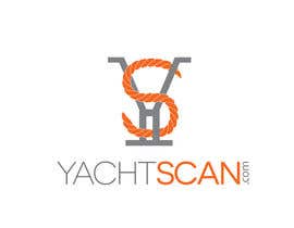
Our website name is: YachtScan.com

We would like the logo to incorporate the two letter Y and S. Attached is an example of what we would like. (samplelogo.jpg)
“S" should reflect rope (orange) Orange should match the orange color of http://www.orange.com/en/home
“Y" shape and color should reflect a cleat (silver iron grey), attached are some picture of cleats. (cleats.jpg)
The full name should be somehow part of the logo (YachtScan.com), not necessarily next to YS as in the attached sample.

We would like a simple sharp logo (no shades and complicated forms), to be memorable and easily recognizable.
Winning bids will be chosen based on creativity, clarity, and punchiness.

Finally the logo should be made in a way to be easy to embroider.
Please provide the logo in high resolution. (Open Format illustrator, Coreldraw etc ..., and close format JPEG)
Also provide the color codes you used.

Thank you!

UPDATE 1
Just wanted to clarify some points based on the current entries:
1. Regarding the Y: when someone looks at the logo, this person should understand that the "Y" represents a "dock cleat".
2. The "S" and Scan should match exactly the color of the attached orange.png.
Thank you!

UPDATE 2
Just added a sample cleat I designed on Paint. This is on the continuation of the great work some of you have done. It must be taken as food for thought of improvement and not start from scratch all over again. We're getting close. I'm sure you guys can do much better than me. Ignore the "S" I made. However getting a creative rope design in "S" shape around the cleat would make the difference. See carefully the cleat design. Some work to do on the "S" shape. Open Logo.jpeg to view it

Các kĩ năng yêu cầu

Phản hồi của người thuê

“Excellent quality of work, easily understood all our requirements and was very responsive. Iwebgal diligence was never questioned, we highly recommend Iwebgal for Design related projects.”

Hình ảnh hồ sơ adpap, United Kingdom.

Bảng thông báo công khai

  • ponetaikin
    ponetaikin
    • cách đây 9 năm

    #39

    • cách đây 9 năm
  • strykunanna
    strykunanna
    • cách đây 9 năm

    #33 #34

    • cách đây 9 năm
  • adpap
    Chủ cuộc thi
    • cách đây 9 năm

    UPDATE 2
    Just added a sample cleat I designed on Paint. This is on the continuation of the great work some of you have done. It must be taken as food for thought of improvement and not start from scratch all over again. We're getting close. I'm sure you guys can do much better than me. Ignore the "S" I made. However getting a creative rope design in "S" shape around the cleat would make the difference. See carefully the cleat design. Some work to do on the "S" shape. Open Logo.jpeg to view it

    • cách đây 9 năm
  • ponetaikin
    ponetaikin
    • cách đây 9 năm

    Hello! I would like to know your opinion about #18 #19

    • cách đây 9 năm
    1. ponetaikin
      ponetaikin
      • cách đây 9 năm

      Like this one #26 ?

      • cách đây 9 năm
    2. ponetaikin
      ponetaikin
      • cách đây 9 năm

      or #27

      • cách đây 9 năm
  • robertarch
    robertarch
    • cách đây 9 năm

    #24 , maybe this is what you are looking for?

    • cách đây 9 năm
    1. adpap
      Chủ cuộc thi
      • cách đây 9 năm

      Thank you very much for the latest update. Some points that may have room for improvement are the following: [1] The "S" of the rope needs to be more clear and visible (an idea why not have a rope shaped in a "S" form with a paint brush instead?). The alignment of the "S" should almost vertical or with a small angle to have some coherence with the "Y" cleat design. [2] Regarding the cleat, the main body I would personally make a bit less thicker and put an horizontal finishing on each extremity of the upper part of "Y". Something like the "Y" with times new roman. [3] For the title I would change the font and use something closer to #2 to have a clear phrasing. For updates please use white fonts only. Thanks

      • cách đây 9 năm
    2. robertarch
      robertarch
      • cách đây 9 năm

      #25 ?

      • cách đây 9 năm
  • Dckhan
    Dckhan
    • cách đây 9 năm

    making

    • cách đây 9 năm
  • ponetaikin
    ponetaikin
    • cách đây 9 năm

    Thank you for rating my design. I am available to make any additional changes.

    • cách đây 9 năm
  • Amoughaoui
    Amoughaoui
    • cách đây 9 năm

    what about my proposition number 6 ?

    • cách đây 9 năm
    1. adpap
      Chủ cuộc thi
      • cách đây 9 năm

      Thank you for your entry, unfortunately it is not really what we describe in the brief.

      • cách đây 9 năm
  • robertarch
    robertarch
    • cách đây 9 năm

    #17 please see entire 3 images of presentation.

    • cách đây 9 năm
    1. adpap
      Chủ cuộc thi
      • cách đây 9 năm

      Very nice images thanks! Here are my comments on them: "S" should be in Orange (as we wrote in the description), "Y" should be in grey (also written in the description), finally the "Y" doesn't resemble much to a "dock cleat".

      • cách đây 9 năm
  • zubairashraf129
    zubairashraf129
    • cách đây 9 năm

    number #7 is great logo i have 4 years experience in this field this is eye catching design.........

    • cách đây 9 năm
    1. adpap
      Chủ cuộc thi
      • cách đây 9 năm

      Hi, #7 is a great logo indeed, but unfortunately it doesn't match the specifications we wrote in the "Brief" section.

      • cách đây 9 năm
  • adpap
    Chủ cuộc thi
    • cách đây 9 năm

    UPDATE 1
    Just wanted to clarify some points based on the current entries:
    1. Regarding the Y: when someone looks at the logo, this person should understand that the "Y" represents a "dock cleat".
    2. The "S" and Scan should match exactly the color of the attached orange.png.
    Thank you!

    • cách đây 9 năm
    1. infosouhayl
      infosouhayl
      • cách đây 9 năm

      plz sir can u check my entry #13

      • cách đây 9 năm
    2. adpap
      Chủ cuộc thi
      • cách đây 9 năm

      Hi, your entry #13 is really nicely designed, but unfortunately it doesn't related to what we are asking.

      • cách đây 9 năm

Xem thêm bình luận

Làm thế nào để bắt đầu với cuộc thi

  • Đăng cuộc thi của bạn

    Đăng cuộc thi của bạn Nhanh chóng và dễ dàng

  • Nhận được vô số bài dự thi

    Nhận được vô số Bài dự thi Từ khắp nơi trên thế giới

  • Trao giải cho bài thi xuất sắc nhất

    Trao giải cho bài thi xuất sắc nhất Download File - Đơn giản!

Đăng cuộc thi ngay hoặc tham gia với chúng tôi ngay hôm nay!