Design a Website Mockup
- Tình trạng: Closed
- Giải thưởng: $20
- Các bài thi đã nhận: 7
- Người chiến thắng: Mahroz52

Tóm tắt cuộc thi
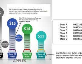
Looking for a design to present and compare pricing data this maybe a horizontal bar graph chart that is interactive and not boring.
Submit innovative exciting designs and ideas to present this data effectively.
See attached Jpeg image to explain
Please understand that
For each apple at $5 - (eg. - Daves store) there is at least 50-100+ stores
For each apple at $8 - (eg. - Millys store) there is at least 50-100+ stores
For each apple at $10 - (eg. - Nickys store) there is at least 50-100+ stores
For each apple at $4 - (eg. - Daphnes store) there is at least 50-100+ stores
For each apple at $... - there is at least 50-100+ stores
For each apple at $... - there is at least 50-100+ stores
For each apple at $... - there is at least 50-100+ stores
For each apple at $... - there is at least 50-100+ stores
For each apple at $... - there is at least 50-100+ stores
Etc….
Etc….
Etc….
Etc….
Etc….
Etc….
Each of All of these store names need to be all seeable at the same time also with a phone number each.
These store names, phone numbers, price, cost and overall data need to be easily changeable.
Also apples will need to be changeable to perhaps Lemons or Bananas or even TV’s or Dishwashers
Thanks and Good luck
Các kĩ năng yêu cầu
Phản hồi của người thuê
“was done ok”
![]() saltpeters, New Zealand.
saltpeters, New Zealand.
Bảng thông báo công khai
Làm thế nào để bắt đầu với cuộc thi
-

Đăng cuộc thi của bạn Nhanh chóng và dễ dàng
-

Nhận được vô số Bài dự thi Từ khắp nơi trên thế giới
-

Trao giải cho bài thi xuất sắc nhất Download File - Đơn giản!