UX/UI Designs for 2 Webpages (#10/#11)
- Tình trạng: Closed
- Giải thưởng: $103
- Các bài thi đã nhận: 9
- Người chiến thắng: leandeganos
Tóm tắt cuộc thi
We are looking to obtain the help of creative UX/UI designers to update the user experience (UX) and user interface design (UI) of two webpages from a WordPress theme:
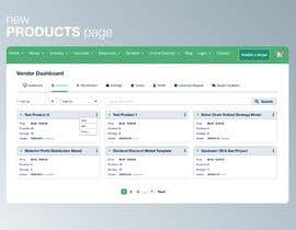
1) Products Page => attached as webarchive file
- show 1 row per product, no need to waste so much empty space
- There also needs to be a dropdwon list for quick product search/filter
2) Add Product Page => attached as webarchive file
- The Industries and use cases on the Add Product Page need to be rearranged either in columns or in any other format to make them more user-friendly.
- Needs to have a modern design which encourages users to list their product
Please note:
- No need to change the header, only propose a design starting from Vendor Dashboard downward.
- Don't touch the footer
- Your design proposal should make use of our corporate colors (see attached) and be similar to an example design (see attached).
- You need to deliver design proposals for BOTH pages, not one page
- Deliverables: Upon selecting the best proposal, you will need to deliver the source files in PSD format.
Here some more guidance:
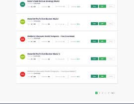
Product List Page (#10):
- Column headers (in grey). Try to come up with a modern design
- Green status dot for each product needs to come on the left of the product names (as product names will have different widths)
- Apart from Purchases, there should also be an Earnings column inserted
- Show also example products with status “Draft” and “Pending”. Use different Font colors (Green, Red, …) for these statuses
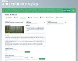
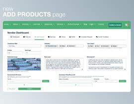
Add Product Page (#11):
- The title is not a Dropdown, its an input field
- Try to reduce the empty white space in your designs, it needs to be a bit more condensed, otherwise, it looks like a hug page
- Reduce the size of featured image field
- The industry is not a dropdown field, vendors can select multiple categories
- Summary and Description should have enlargeable field sizes => put a triangle symbol bottom right
- Make sure all buttons are properly aligned
- Uses Cases are badly placed, should be placed after industry selector. Also use cases allow for multiple option selection, not a dropdown list
- On the top of the page, you should also add Earnings and Orders of this product somewhere
Các kĩ năng yêu cầu
Phản hồi của người thuê
“Creative designer. Very good work!”
![]() invalt, Switzerland.
invalt, Switzerland.
Những bài dự thi tốt nhất dự cuộc thi này
-
phutagalung Indonesia
-
phutagalung Indonesia
-
phutagalung Indonesia
-
phutagalung Indonesia
-
SK813 Bangladesh
Bảng thông báo công khai
Làm thế nào để bắt đầu với cuộc thi
-

Đăng cuộc thi của bạn Nhanh chóng và dễ dàng
-

Nhận được vô số Bài dự thi Từ khắp nơi trên thế giới
-

Trao giải cho bài thi xuất sắc nhất Download File - Đơn giản!


